- Aug 5, 2025
- 2 min read
Interior colour choices are getting nuanced as blends like blurple (blue + purple), yorange (yellow + orange), and greige (grey + beige) are fast becoming the go-to choices for creating sophisticated, layered interiors with personality.
James Mellan-Matulewicz, Interior Designer and Creative Director at Bobbi Beck shares his expert insight on why these “almost colours” are rising in popularity and how to use them effortlessly at home.
“In-between colours offer the best of both worlds. They're soft enough to feel subtle, but still bring a unique twist to a space. These shades have depth, adaptability, and a natural harmony that flat, primary colours often can’t achieve.”
Why In-Between Colours Work
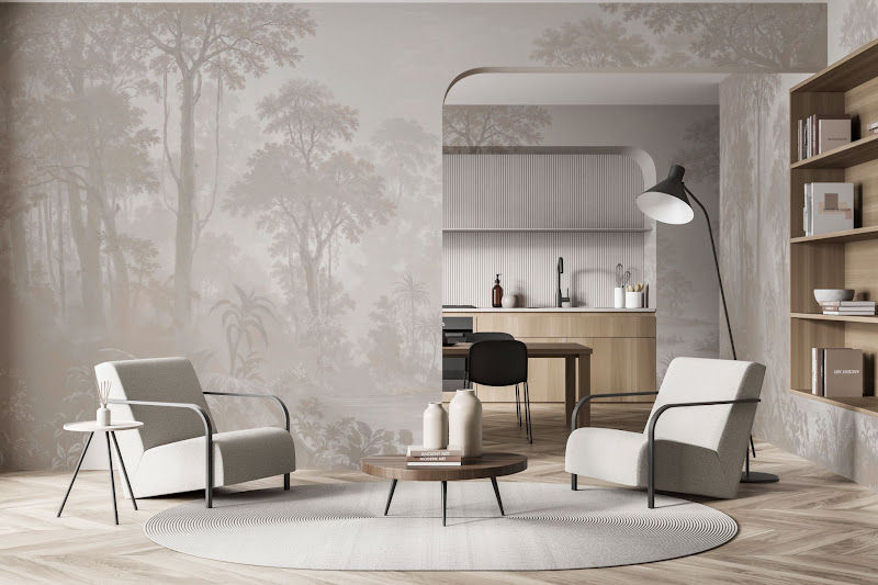
“Unlike traditional bold shades, colours like blurple and yorange are beautifully ambiguous. They shift subtly with natural light, adding mood and movement to your walls throughout the day. Greige, long loved for its versatility, continues to dominate in minimalist and layered interiors alike, pairing easily with stone, wood, and textured finishes.
These colours offer emotional depth. Blurple feels rich and cocooning, perfect for reading nooks or bedrooms, while Yorange can bring warmth and playful vibrancy to kitchens and hallways. Greige, meanwhile, is a grounding neutral that works in virtually any room or open-plan space.”

Where & How to Use Them
Blurple: Ideal for feature walls or soft furnishings, blurple adds an unexpected richness that feels both moody and modern. Pair it with off-whites, blush pinks or velvet textures for a luxe feel.
Yorange: A joyful pop in otherwise muted spaces. Use it in soft doses through wallpaper, art, or ceramics to bring life into neutral schemes.
Greige: The ultimate balancing act, equally at home in minimalist, rustic, or coastal interiors. Use as a base wall colour or across textured wall coverings to create warmth without overpowering.
As interior design continues to favour tone, texture, and atmosphere over statement brights, in-between colours offer a more refined way to express character in the home.